
Your Recipe Library, Photos First: Grid View on iPad and iPhone
Angel Azcarraga · September 1, 2026
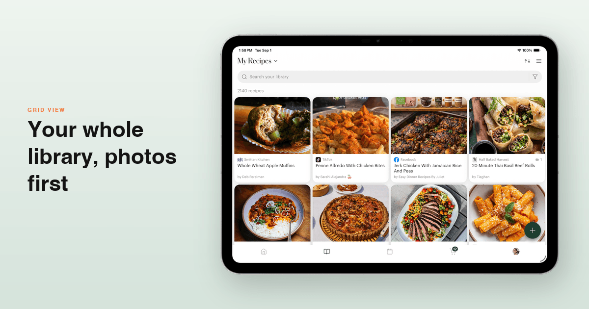
A recipe library shaped for a phone makes poor use of a tablet: one recipe per row, however much screen you give it. On iPad and Android tablets, Deglaze lays your library out as a grid of recipe photos that uses the full width of the screen.
On iPhone, the list still suits plenty of people — but not everyone. So the grid is there too, as a toggle you can flip per device.
As many columns as your screen has room for
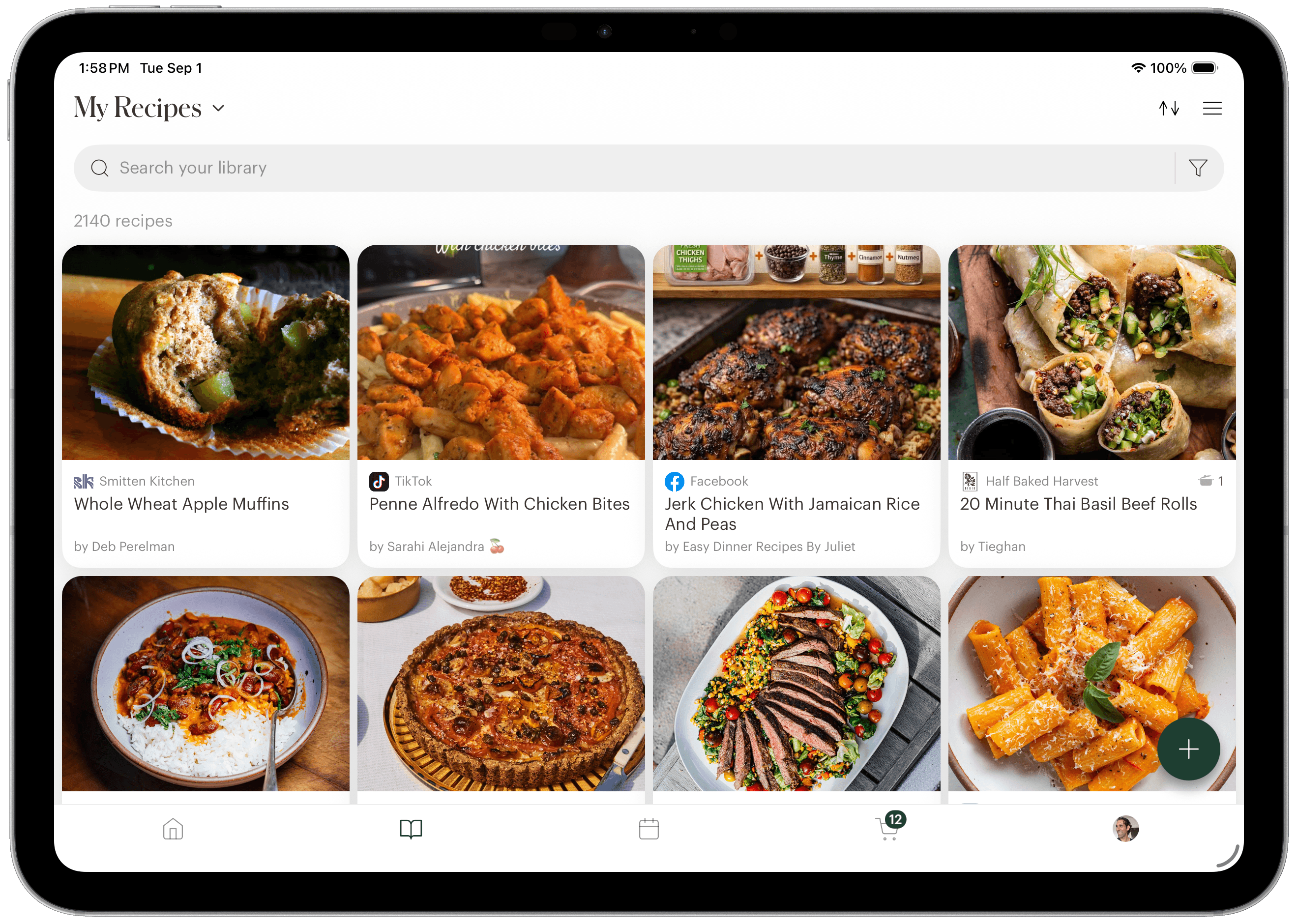
The grid isn't a fixed number of columns — it fills the width you give it. An 11-inch iPad shows three columns held upright and four turned sideways; a 13-inch shows more. Split-screen it next to something else and it adapts to the slice it's given.
Each tile leads with the photo, big, and puts the title, source and author underneath it.
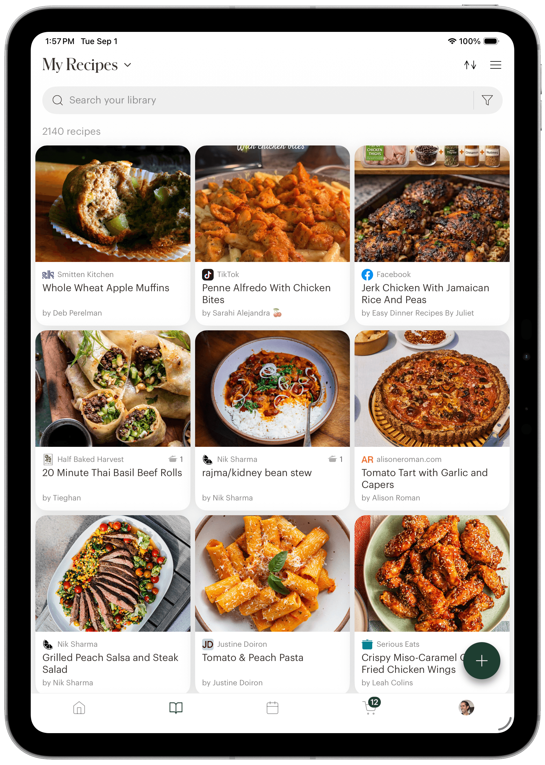
On a tablet the grid is the layout: there's no switch back to a list, since a row per recipe is the thing it exists to avoid.
On your phone, a toggle
Phones are the case where both layouts genuinely earn their place. A two-column grid is the fastest way to recognize something by its photo. A list fits more titles on screen and gives long recipe names room to breathe. Which one you want depends on how you use your library, so there's a switch on the count row.
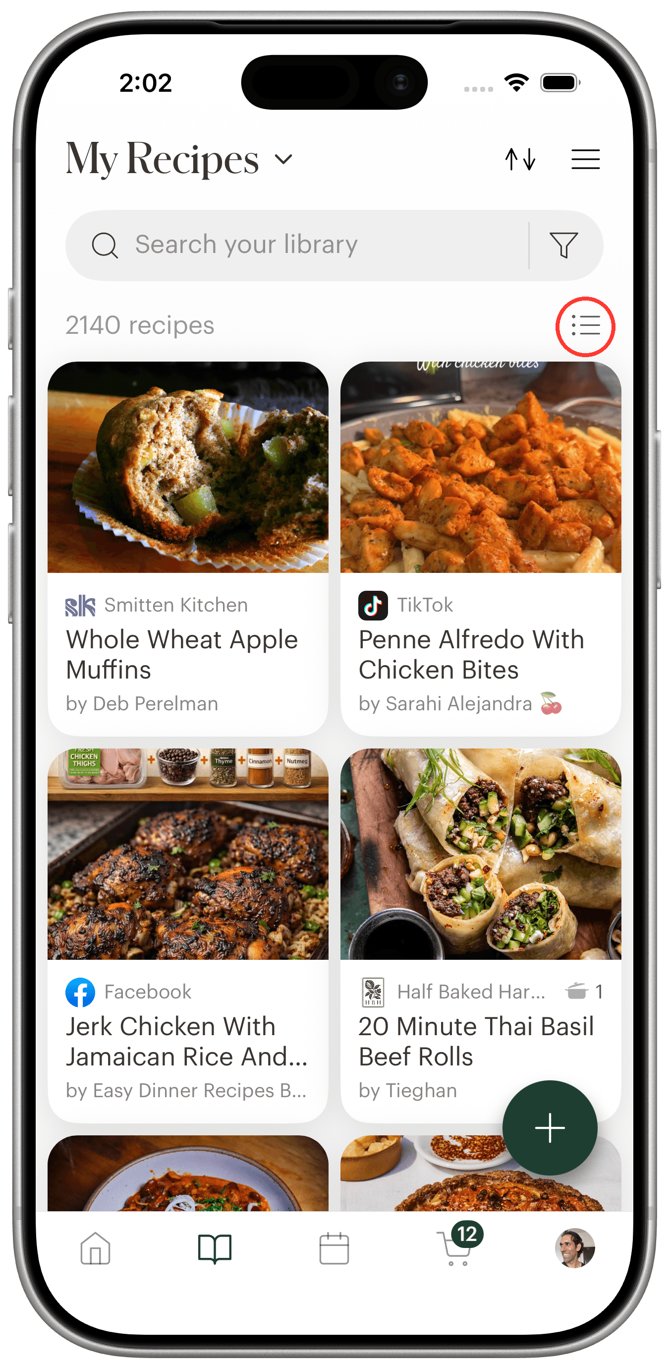
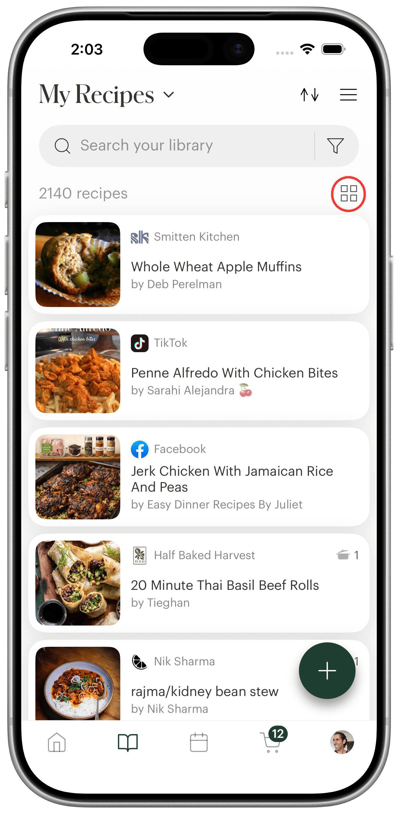
The control is the small icon beside your recipe count, circled above. It shows where tapping will take you: a list icon while you're in the grid, a grid icon while you're in the list.
Your choice is per device, not per account. Grid on the phone in your pocket and list on the one on the counter is a perfectly reasonable way to live, and how you like to look at a screen is a property of that screen — not something that should follow your login onto every device you own.
Collections and search work the same way
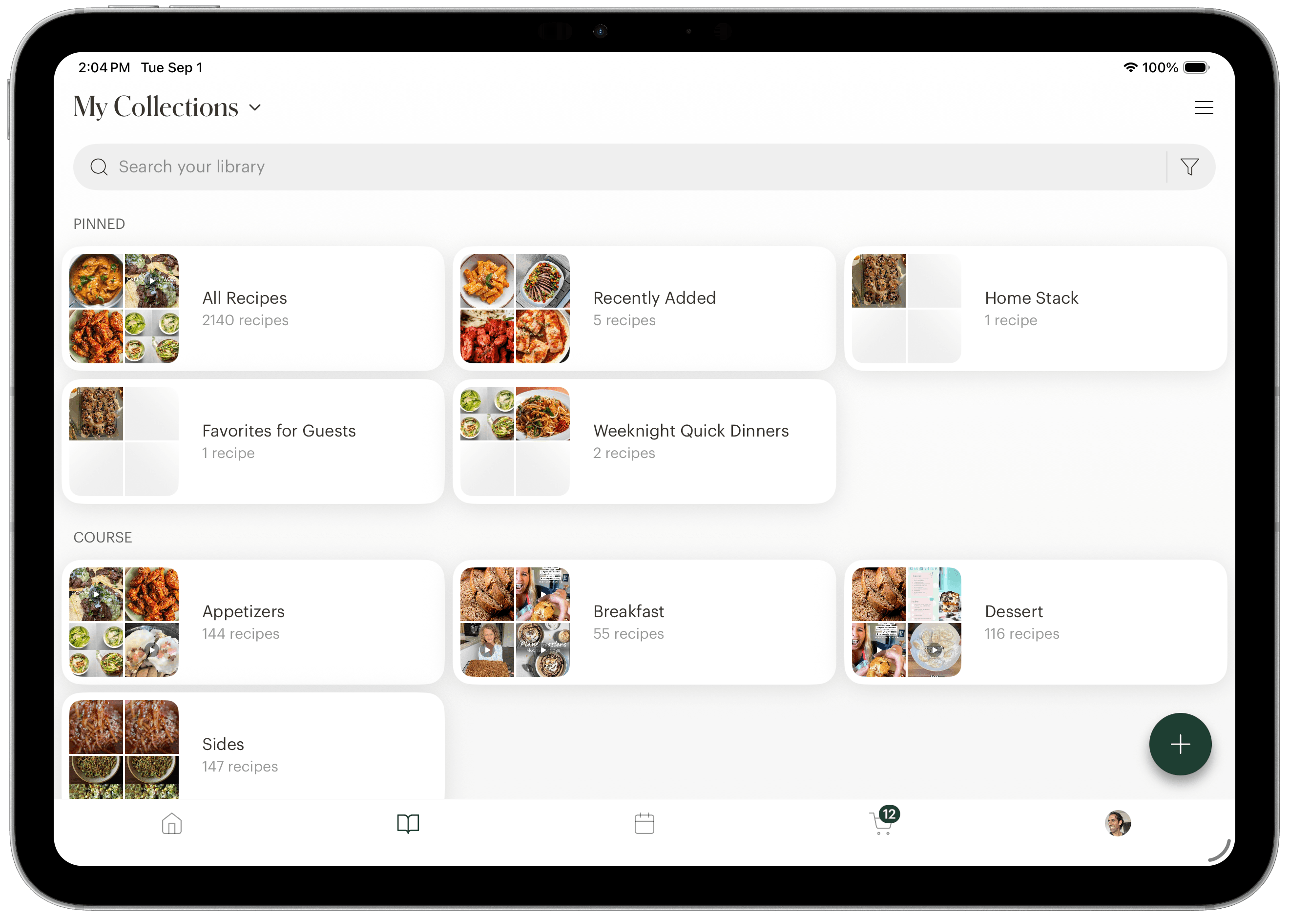
The grid isn't only the main library. Recipe collections lay out as a grid of their own, with cards wide enough to fit a readable collection name beside its photo mosaic and count — a different shape from a recipe tile, so it gets its own sizing rather than being forced into the same cells.
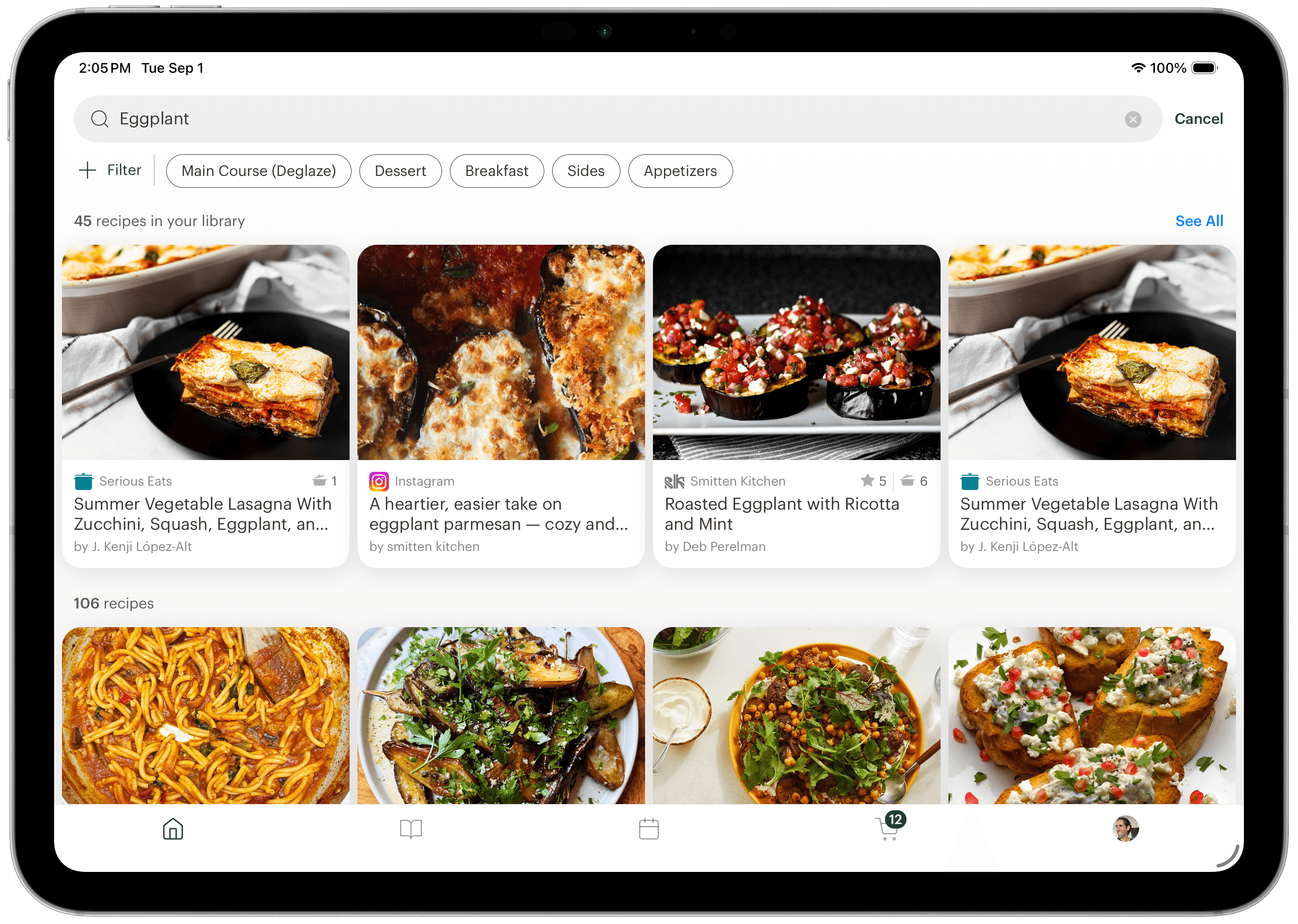
Search follows the same pattern. When you search on a wide screen, the recipes already in your library come back as a single row of tiles with a See All link, so your own recipes get a proper look-in without pushing everything else off the bottom of the screen.
The grid also reaches meal planning and bulk editing — the recipe picker you use when adding to your plan, and the multi-select screen for filing recipes into collections, both lay out the same way. Picking dinner from photos beats picking it from a list.
Where to find it
Open the My Recipes tab. On an iPad or Android tablet you'll be in the grid already. On a phone, look for the small icon to the right of your recipe count and tap it.
If your library is more of a pile than a collection, photos will help but organizing helps more — our guide to organizing recipes covers collections, tags and the rest. The Deglaze web app uses the same grid, so your library looks the same wherever you open it.
Grid view works on iPhone, iPad, and Android, and it's part of the free plan — no subscription needed. Download Deglaze for iPhone, iPad, or Android; new users get a free trial of Deglaze Pro for unlimited imports, meal planning, and smart grocery lists.